Best practices for designing layouts
In addition to planning the structure of your database as described in About planning a database, FileMaker recommends you sketch your layouts on paper or onscreen before creating them in FileMaker Pro. A few sketches can help resolve design problems, communicate ideas, and save time. The sketching process can also help you create layouts that are visually balanced and provide a clear path for users to follow.
A theme affects characteristics of a layout, such as the background color, field borders and fill, and text attributes in text objects and in fields. The Starter Solutions that come with FileMaker Pro illustrate how themes might be used to produce layouts containing operating system-appropriate effects.
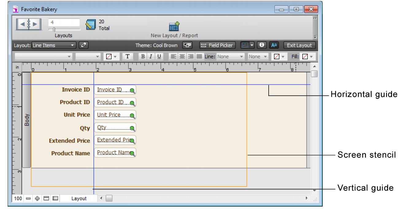
Click the arrow on  in the layout bar to display screen stencils that help you design layouts optimally for iPad, iPhone, and several common desktop resolutions. You can have multiple screen stencils visible at the same time. See Sizing layouts for different devices.
FileMaker Pro provides several tools to help you quickly and precisely size, position, and align layout objects. Guides help you align layout objects vertically or horizontally within the same layout or across multiple layouts. Dynamic guides give you visual cues as you work with layout objects. See Using guides and dynamic guides.
|
•
|
