Best practices for designing layouts
In addition to planning the structure of your database as described in About planning a database, FileMaker recommends you sketch your layouts on paper or onscreen before creating them in FileMaker Pro. A few sketches can help resolve design problems, communicate ideas, and save time. The sketching process can also help you create layouts that are visually balanced and provide a clear path for users to follow.
A theme affects characteristics of a layout such as the background color, field borders and fill, and text attributes in and outside of fields.
Select one of the themes in the New Layout/Report assistant or Change Theme dialog box that best suits the purpose of your layout. If your layout will be used on an iOS device, choose one of the device themes.
Note If you change the theme of a layout, then undo the change, any custom styles set on objects (including locked objects) reappear on the layout, but the new theme remains. If you undo again, the layout reverts to the previous theme.
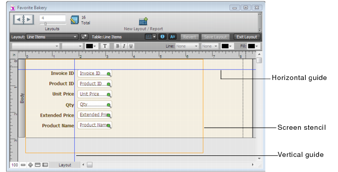
Click the arrow on  in the layout bar to display screen stencils that help you design layouts optimally for iPad, iPhone, and several common desktop resolutions. You can have multiple screen stencils visible at the same time. For more information, see Sizing layouts for different devices.
FileMaker Pro provides several tools to help you quickly and precisely size, position, and align layout objects. Guides help you align layout objects vertically or horizontally within the same layout or across multiple layouts. Dynamic guides give you visual cues as you work with layout objects. For more information, see Using guides and dynamic guides.
A characteristic of a well-designed layout is a consistent appearance among the layout objects. You can use the Format Painter tool  in the status toolbar to quickly duplicate the attributes of layout objects. For more information, see Copying style attributes between objects or layout parts.
You can use the undo and redo features to incrementally remove or replace changes to layout objects.
Some common symbols can be misinterpreted in some contexts. For example, a flag icon used as a warning icon may indicate success in some cultures. Test your symbols and images with a diverse audience before putting your layouts into use.
