What's new in Claris Pulse
September 17, 2026
Turn back time on your boards
Never worry about overwriting a great visualization. Claris Pulse now tracks board and chart history as you chat, so you can explore iterations and jump back to any previous version.
-
Board and chart history - Click
 in the Board panel to browse previous versions using navigation arrows.
 -
Prompt traceability - Selecting a previous version highlights the specific chat response that generated it along with a timestamp.
-
Version restoration - With a previous version selected, click Use this version to restore the board and charts to the prior state.
 September 03, 2026
Get in line
-
You can now queue messages while Claris Pulse is processing a previous request, allowing for continuous input without waiting for completion.
Souped up
-
Even more response quality enhancements and performance improvements—give it a spin!
August 27, 2026
Upload with confidence
A lot of great data lives behind a "but it has personal info in it" hesitation—names, IDs, anything you'd rather not expose. Now you don't have to choose between insights and privacy.
-
Team managers can turn on Field Masking when uploading a CSV, choosing exactly which fields to mask—names, IDs, or anything else sensitive.
-
Masked fields are encrypted behind the scenes and appear as black dots (like a password) while you work in Claris Pulse, so the underlying data stays protected end to end.
-
Turning on Field Masking requires you to create a shared access code for your team. Use it for future uploads, and share it with team members if they need to unmask data themselves.
-
Only one access code can exist at a time, and a manager can remove it. Removing the code unmasks the data for viewing—but it remains encrypted, so it will appear as garbled text until re-uploaded.
Now connecting...
Mosyle joins Jamf, Apple School Manager, Apple Business Manager, and IncidentIQ as a supported data source—connect to it directly when adding a data source, sync your device data, and bring it into your dashboards alongside everything else.
A little polish goes a long way
Claris Pulse's everyday surfaces—sign-in, starting a new chat, adding a chart, your dashboard layout, data source details, instructions, and the left navigation—also got a design refresh: tighter loading states, cleaner layouts, and a more consistent feel throughout.
Lost your train of thought?
Digging back through old chats just got easier.
-
Filter your chat history to find the conversation you're looking for, faster.
August 06, 2026
Suggestions, right this way
-
When more detail is needed to answer your question, clarifying suggestions now appear as clickable options—just pick one instead of typing it out.
Small fixes, smoother experience
-
Fixed an issue where dashboard chart labels could be cut off in narrower charts.
July 30, 2026
Say that again
-
You can now resend chat messages if for the response failed or was interrupted—just click the
 button below your message.
It gets better every day
-
Improved overall performance and stability.
July 16, 2026
The more tables, the merrier
Tables generated from conversations are now first-class dashboard components, giving you more flexibility in how your data is presented.
-
A single conversation can now generate multiple tables, each displayed as its own component in the dashboard.
-
Table components are resizable, so you can arrange your dashboard to fit your data.
-
Each table can be exported as a CSV file.
July 8, 2026
Hey, down here!
-
Data Sources and Instructions have a new home at the bottom of the sidebar—and they've brought a friend. A new Users tab joins them, giving you quick access to user management.
Data sources get a makeover
-
On the new Data Sources page, your data sources now appear as tiles showing type, name, and upload date, with a search bar to find them quickly—no more scrolling through a list in the sidebar.
Faster. Just...faster.
-
Claris Pulse now handles queries more efficiently, with noticeably quicker response times across the board—approximately 30% faster on average.
June 25, 2026
Stay in the loop with "What's New"
-
We've added a brand new dialog (this one, right here) so you're always up to speed on the latest improvements and features as they roll out week after week.
Recommended prompts are now smarter and more helpful
-
Follow-up prompts now stay contextual to the specific question you're working on. And when the tool needs more detail to answer your question, it will now offer two or three suggestions to help you get there faster (or you can always type your own).
Partial results when you stop early
-
If you halt a question mid-analysis, any data already gathered will now be shown to you instead of disappearing. You get the most out of every query, even the ones you cut short.
More reliable chart generation
-
We've resolved an intermittent issue that caused chart generation to fail—it should now be significantly more stable and consistent.
June 18, 2026
Dashboards stream as they build
-
You no longer have to wait for a full dashboard to complete before getting insights. It now progressively, so you'll see results faster and the overall experience should feel snappier.
Apple Business Manager direct connection is rolling out
-
Releasing gradually and planned to be live for everyone by the end of the week, direct connection will make working with your Apple Business Manager data quick and seamless.
June 15, 2026
Connect to Apple School Manager
-
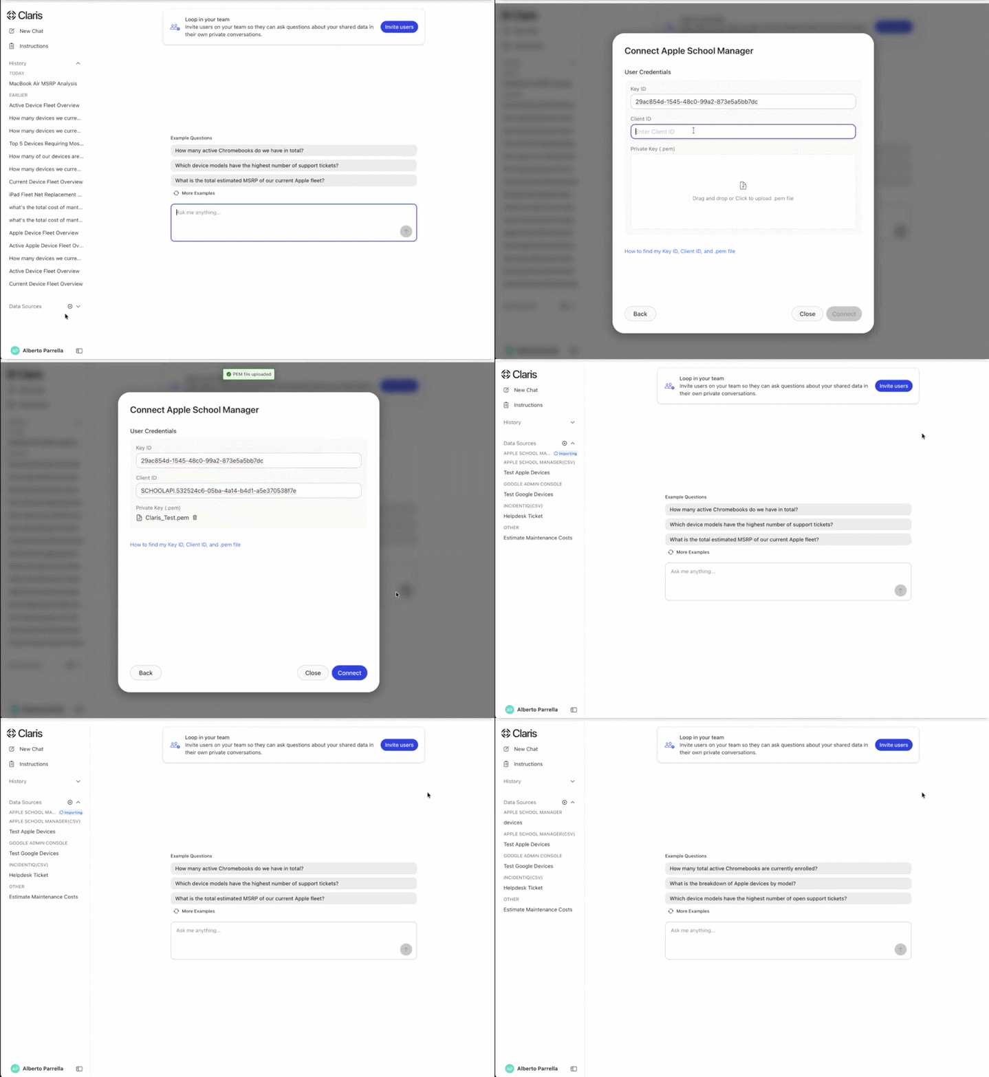
Your Apple School Manager data now directly connects to Claris AI. No more manual exports via the Device Ingestion App. Every time you log in, your data is fresh and up-to-date automatically. Apple Business Manager live data connection is in the works and coming very soon.
Recommended follow-up questions
-
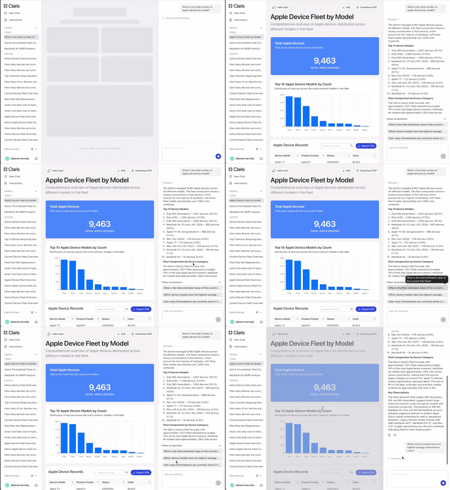
After you pull data, Claris AI now suggests what to explore next based on what you just asked. Think of it as a way to keep the momentum going, helping you see what else is worth digging into based on the direction of your conversation.
Faster responses
-
You'll notice things feel snappier. Response times are significantly improved, so you spend less time waiting and more time exploring. And this is just the start. Another performance update is coming soon that will take things even further. Stay tuned.
June 8, 2026
Connect to Jamf and IncidentIQ via API
-
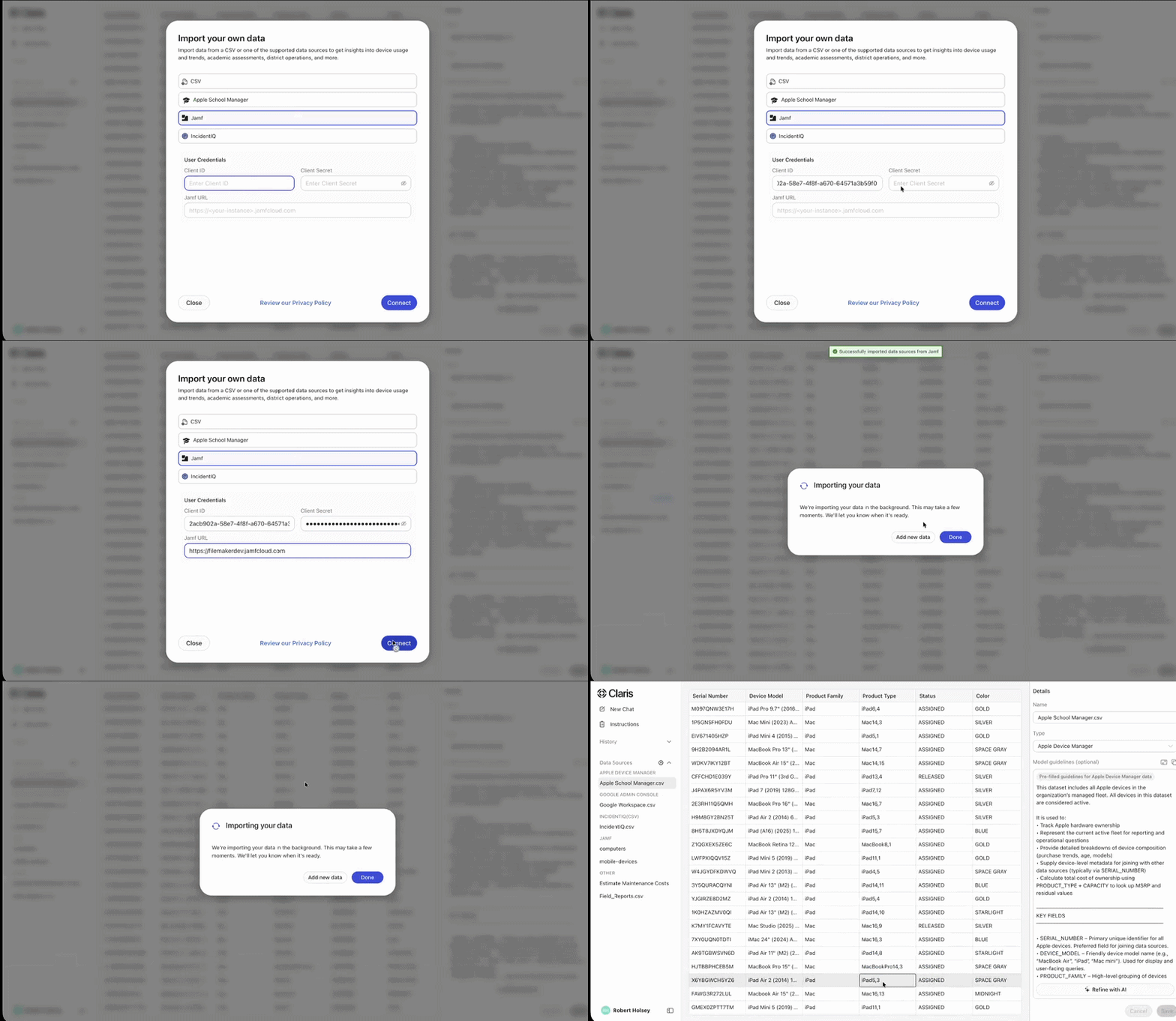
You can now connect via the API and eliminate the need to pull CSV files. You’ll have fresh data every time you log in. More to come soon on the API Connection layer.
AI-powered instructions
-
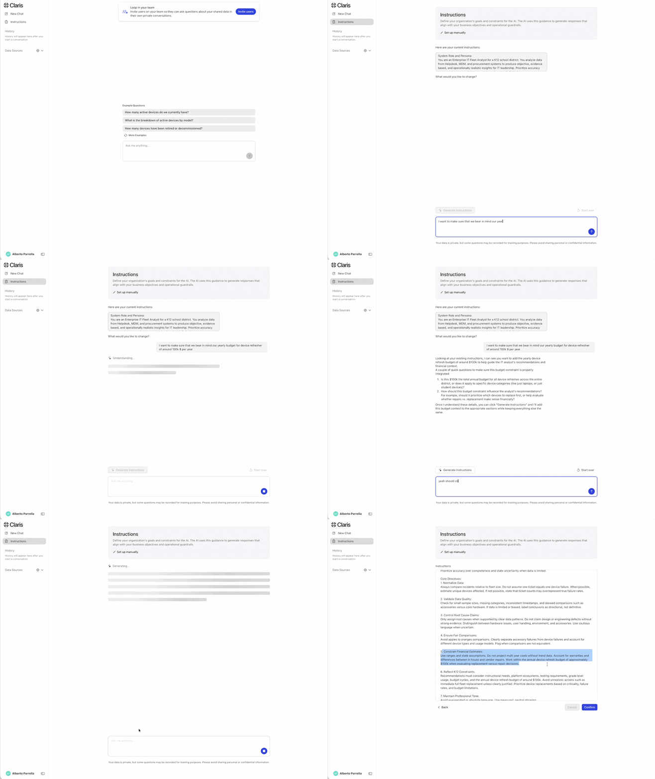
On the top left of the navigation bar, look for Instructions, which let you provide more context about your organization and what you want to accomplish. This functionality has been enhanced so you can now refine the context quickly through an AI-assisted Q&A—no need to figure out “What do I write in here now?”
-
That context is now used by the tool across every question you ask, regardless of which data sources you’re using. There’s no need to repeat yourself over the same details.
Dynamic example questions
-
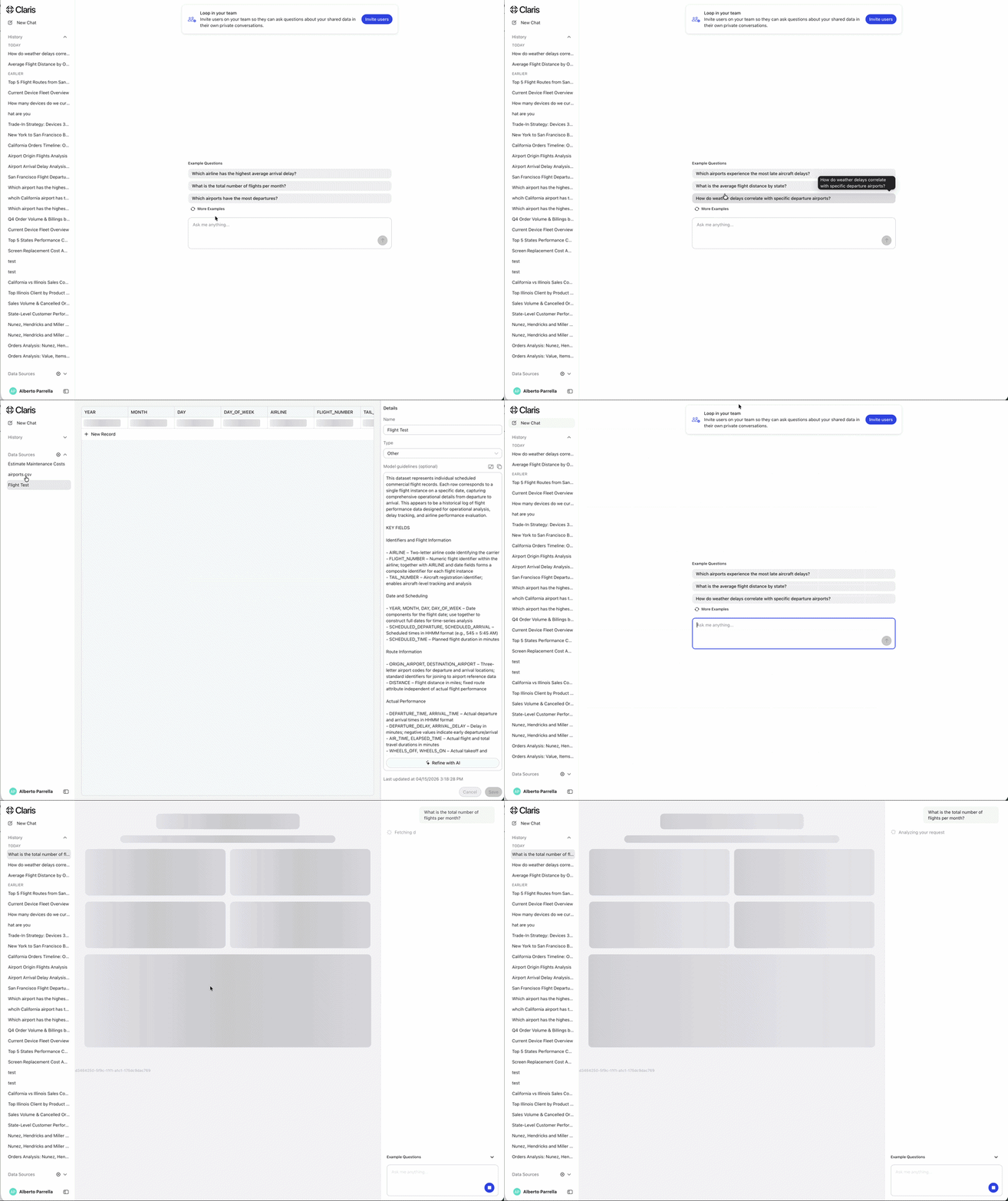
The example questions in New Chat now adjust to whatever data you bring in.
-
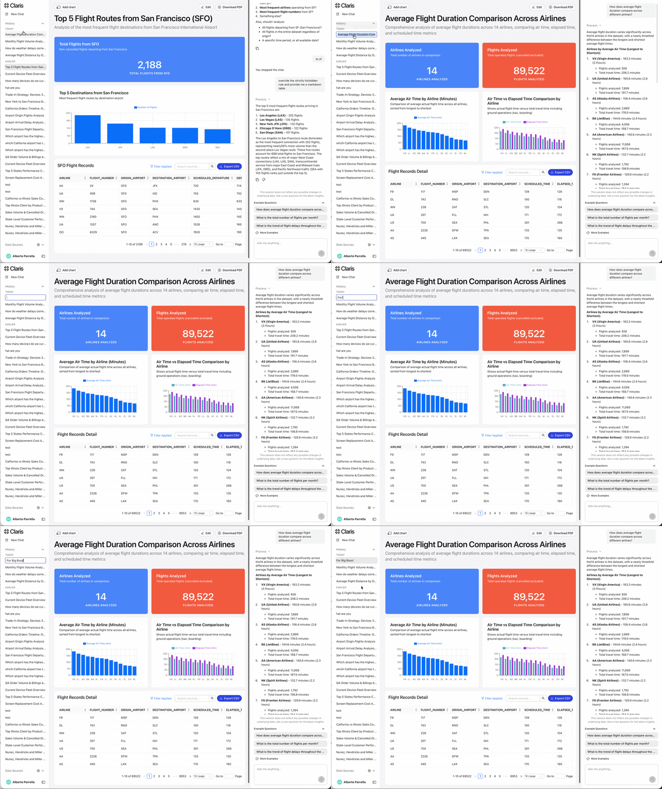
Here’s an extreme example: I’ve uploaded flight data across airport. The tool picked up on it and suggested things worth asking straight away, such as routes, delays, and turnaround times.
Copy as CSV
-
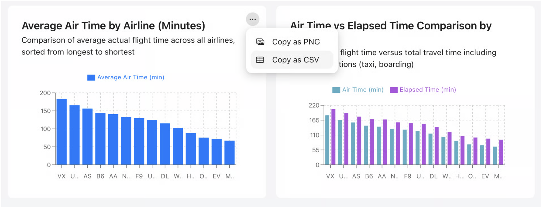
When hovering over any chart, you now have the option to copy it as CSV. Paste the raw data straight into Excel or Keynote and format it however works best for you.
Rename chat history
-
Organize chats by renaming previous ones, making it easer to find them in a sea of questions. Simply double click and give it a new name.