Creating and editing charts in Layout mode
To create or edit a chart:
- To create a chart, do one of the following:
- Open a layout. See Creating and managing layouts and reports. If necessary, resize the layout part so there is room for the chart. See Resizing layout parts.
- Use the New Layout/Report assistant to create a new layout for the chart. A blank layout works well for displaying a chart. You don't need to add fields to the layout to plot data in a chart. See Creating a layout.
To edit a chart, double-click the chart on the layout.
- In Layout mode, click the Chart tool
 in the status toolbar, then drag a rectangle where you want the chart to appear, or choose Insert menu > Chart.
Note Charts created in Layout mode appear differently depending on the layout part in which they are placed. See Placing your chart in the appropriate layout part.
The Chart Setup dialog box appears. You can change settings in the Chart inspector on the right to modify the chart. The preview helps you work efficiently in the Chart Setup dialog box. See Using the chart preview.
- Click Done.
You see a placeholder image of the chart in Layout mode, with sample data.
- Choose Layouts menu > Save Layout, then click Exit Layout.
You see the chart based on data in the database.
|
To |
Do this |
|
Add a title to the chart |
For Title, type or change the chart title, or click |
|
Choose a chart type and specify the data series |
See Column, bar, line, and area charts (including stacked column and bar and positive/negative charts), Pie charts, or Scatter and bubble charts. |
|
Change data labels, show or hide tick marks and set tick mark scale (if applicable), and format data |
|
|
Change the color scheme, legend, or fonts in the chart |
Click Styles in the Chart inspector, then see Changing the look of a chart. |
|
Specify the type of data the chart uses (records in the found set, delimited records, or related records) |
Click Data Source in the Chart inspector, then see Specifying the data source for a chart. |
 to specify a title.
To chart summary data in Layout mode:
- In Browse mode, sort data by the appropriate break field to form groupings (categories) of data. See Working with data in Table View or Sorting records by subsummary values.
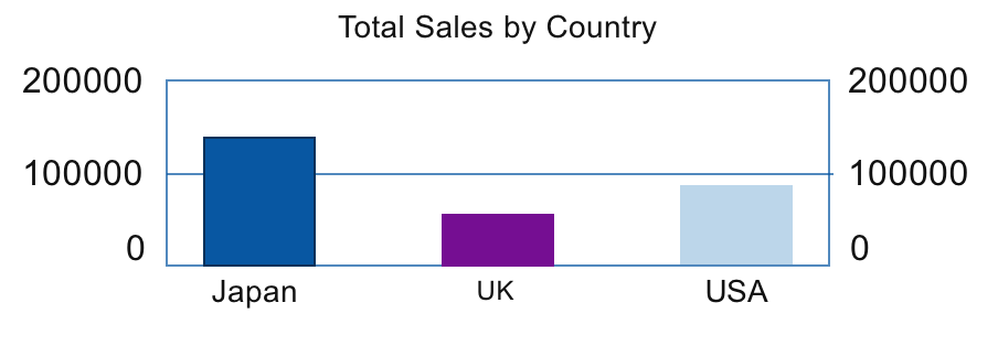
For example, to chart worldwide sales by country, sort data by the Country field.
- Create a summary field in your database to calculate an aggregate value for the category. See Creating dynamic reports in Table View or Defining summary fields.
For example, to chart total sales, create a summary field Total Sales that sums the Sales field.
- Create a chart in the body, header, footer, top or bottom navigation, subsummary, or grand summary part of the layout. See Placing your chart in the appropriate layout part.
In the Chart inspector, click Chart.
- For X-Axis (Horizontal) or Category Labels (pie charts), specify the sort field.
For example, the Country field.
- For Y-Axis (Vertical), or Slice Data (pie charts), specify the summary field.
For example, the Total Sales field.
In the Chart inspector, click Data Source.
- For Chart Data, select Current Found Set.
- For Chart display when layout is sorted, select Summarized groups of records.
The chart compares total sales by country.
- For X-Axis (Horizontal) or Category Labels (pie charts), specify the sort field.
You can also chart summary data by subcategory (for example, total sales by company within one country). To do so, you could change the chart settings specified in this example as follows:
- sort records by the main category, then the subcategory (for example, sort by Country, then by Company)
- set the x-axis or category labels to the subcategory (Company)
- place the chart in a subsummary layout part sorted by the main category (Country)
This chart compares total sales by company within one country.