Best practices for designing layouts
Sketch your layouts
In addition to planning the structure of your database as described in
Creating a solution, FileMaker recommends you sketch your
layouts on paper or onscreen before creating them in FileMaker Pro. A few sketches can help resolve design problems, communicate ideas, and save time. The sketching process can also help you create layouts that are visually balanced and provide a clear path for users to follow.
Identify the devices that will access your layout
Devices vary by hardware and network performance, screen size, and resolution. If you identify which devices will access the layout, you can better design the layout to work with those devices. For example, a layout designed for a desktop computer may not work well on an iOS device.
To provide an optimal solution for users, design your layout to adapt to each device. Design each layout for a range of device sizes, and configure the auto-resize options for layout objects based on the layout’s height and width. This ensures that the layout expands to fill the entire screen for each device. See
Setting auto-resize options for layout objects.
If a wide variety of devices will access the layout, consider creating a layout for each device. You can direct users to the appropriate layouts with the
OnLayoutEnter script trigger, the
Get(SystemPlatform) function, and the
Go to Layout script step.
Understand the capabilities of each FileMaker product
Each FileMaker product has unique features. For example,
FileMaker Go can capture signatures, and
FileMaker WebDirect is accessible from any compatible web browser. It is important to understand each FileMaker product’s features so you can design layouts that will work best with each product.
Use the screen stencils and positioning tools
Click the arrow on

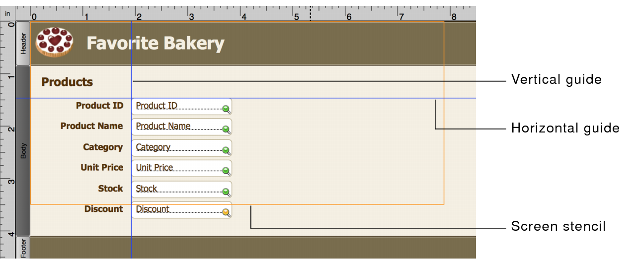
in the layout bar to display screen stencils that help you design layouts optimally for iPad, iPhone, and several common desktop resolutions. You can have multiple screen stencils visible at the same time. See
Sizing layouts for different devices.
FileMaker Pro provides several tools to help you quickly and precisely size, position, and align layout objects. Guides help you align layout objects vertically or horizontally within the same layout or across multiple layouts. Dynamic guides give you visual cues as you work with layout objects. See
Using guides and dynamic guides.
Use a theme that suits the purpose of your layout
A theme affects characteristics of a layout, such as the background color, field borders and fill, and text attributes in text objects and in fields.
Select a theme in the Change Theme dialog box that best suits the purpose of your layout. (Click

in the
status toolbar to display the dialog box.) For example, to work with a theme that has simple lines, colors, and
styles, choose the Minimalist theme. If your layout will be used with FileMaker Go, choose one of the Touch themes (for example, Minimalist Touch).
If you change the theme of a layout and then undo the change, the new theme remains, but any formatting attributes you applied previous to applying the new theme are displayed. If you undo again, FileMaker Pro returns the layout to the state it was before you applied the new theme.
Consistently duplicate layout objects
A characteristic of a well-designed layout is a consistent appearance among the layout objects.
You can use:
•Predefined object styles that come with FileMaker Pro or custom styles you create to format objects consistently on one or more layouts in a file or in multiple files in a solution. When designing layout styles to be used throughout a file, it’s best to work on one layout developing all the styles you need and then save them in a theme so you can apply styles consistently throughout all layouts. See
Creating and working with styles for layout objects, parts, and the layout background •Undo and redo commands in the Edit menu to incrementally remove or replace changes to layout objects.
Optimize layout performance
To improve the overall performance of your layout, keep the following practices in mind:
•In List View and portals, minimize the number of layout objects displayed simultaneously.
•Minimize the number of portals and panel controls.
•Minimize the size and number of shadows.
•Minimize the use of unstored calculations and script triggers.
•Create several layouts with fewer objects rather than one layout with many objects.
•Create custom themes and custom styles rather than overriding existing themes and styles.
Test your layouts with a diverse audience
Some common symbols can be misinterpreted in some contexts. For example, a flag icon used as a warning icon may indicate success in some cultures. Test your symbols and images with a diverse audience before putting your layouts into use.
 in the layout bar to display screen stencils that help you design layouts optimally for iPad, iPhone, and several common desktop resolutions. You can have multiple screen stencils visible at the same time. See Sizing layouts for different devices.